
Navigation is just like the soul of a site. It not only eases the users but also give direction to actions to take. It is like the roadmap for the site. Web design experts often advise keeping the navigation menu simple so that they don’t have to think while browsing your website.
On the other hand, the trend of navigation menu is developing. The user of mega navigation menu is growing slowly. It seems logical as well if your list is not catering all the options then what is the point of it.
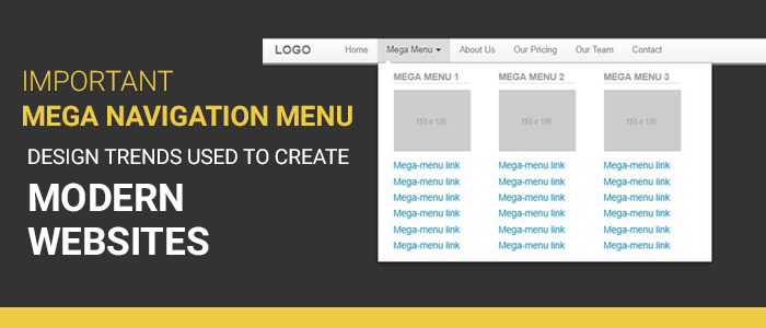
The primary purpose of this post is to spread the trend list of mega nav menu designs that are voraciously used by modern websites. So, let’s get you started with the design trends that will make your navigation menu crisp. Without further ado, let’s get you started,
The Column Structure with Deep Level Categories
If you ask me the best way to present your navigation menu is in column structure. With such layout, you can create deeper links without any flyout menus. The navigation menu will span your entire page which will help you to add 3-4 columns in a single dropdown.
There are many approaches to designing a deep level category. You can attach a link for each category with further links in the sub-category. This approach is the most popular way and is frequently used by Ecommerce stores. The best example and my favourite one is the website of Puma.
They break the navigation items into categories. They divide the entire navigation menu into demographics and items. Inside each mega nav menu, they include columns with each item type. You can also customise the font to stand out the headers from the links. Your mega nav menu is limited only if your creativity is confined within a definite paradigm. Innovate and use deep level categories.
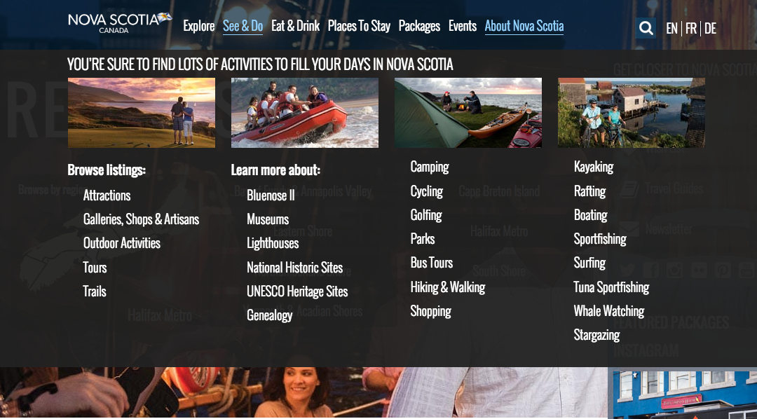
A Full-Width Dropdown
This trend may not be that much popular as the deep level categories, however it is still in use. It will span the entire width of your web page in desktop and mobile devices. You may not be able to see its full effect as mobile devices hide the menu effects.
There are many ways through which you can design and represent your full-width dropdown. The first approach can be keeping the width of the content in the menu as same as the web page while the menu will span the entire page.
One very innovative method of using the full-width dropdown is by the DigitalSpy. They split the menu into categories of the normal drop-down link and thumbnail link to increase the engagement. It attracts the users to click the links with pictures. You can use it for your most popular contents.
Get A Mix Of Images & Texts
Adding more images to a website is always appreciable. The audience always loves to break down the content with the help of images. As we all know, mega nav menus work better on bigger screens. It is safe to say that using mega nav menu for larger screens with images will have a better level of engagement.
The best practice for this will be using images to define the categories and then catering deep links to the subcategories. Another practice which is to use icons. They are vector images so they will be faster than the images. Also, they are more direct than the images. You can designate the categories with icons and then introduce links in the subcategories and products. Have a look at this PlayStation’s drop-down menu.
Alternate Dropdown Techniques
Always be open to experiments when you are designing mega navigation menu. Make use of custom animation, multiple columns and flyout menus. Push your creativity and create wonders with your mega navigation design.

Winding It Up
Let’s have a look at what we have discussed so far,
- There are many approaches to designing a deep level category. You can attach a link for each category with further links in the sub-category. This approach is the most popular way and is frequently used by Ecommerce stores.
- There are many ways through which you can design and represent your full-width dropdown. The first approach can be keeping the width of the content in the menu as same as the web page while the menu will span the entire page.
- Adding more images to a website is always appreciable. The audience always loves to break down the content with the help of images. As we all know, mega nav menus work better on bigger screens. It is safe to say that using mega nav menu for larger screens with images will have a better level of engagement.
- Always be open to experiments when you are designing mega navigation menu. Make use of custom animation, multiple columns and flyout menus.
I hope that you like the post. What are your thoughts on this? Let me know via comments. Till then, Adios!!!